ANA X Inc.
ANA Mileage Club App
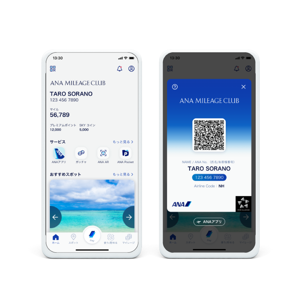
This is the official app for the 'ANA Mileage Club', a mileage service provided by the ANA Group.
The app to deliver the various services
ANA Mileage Club is the officall app for the members where Fenrir was tasked to take part in the major overhal in their 'Super App Scheme,' aimed to combine the various functions and services. The assingment ranged from developing the app concept, the strategy, the design, all the way to the actual development.
With the new app, users can not only manage their mileage and purchase air tickets but also use their miles to book hotels and air tickets. It will eventually offer e-commerce as well as payment services through the mini app which is all part of the long-term vision to become the core app to serve all the ANA markets.
Research / Concepting
To be an app for everyday use
ANA was looking to build their profit in areas outside of their airline business which led to this project to overhaul their app which used to be a tool to simply display the mileage to one that can deliver a wide range of services for their everyday.
Fenrir worked with the project team from the beginning to understand and analyze what users want and need from which we proposed various service concepts that would position the new ANA app as an everyday tool.
Concept: "Action Trigger"
Initially, we proposed two service functions that played to the strength of the ANA Group as well as drive profit which were "Earn miles by using various services" and "ANA Pay(payment service).
However, the client was keen to offer an entirely new user value through the app so we went back to our reserach results and the ANA businesses and came up with an updated concept, "App that works as a trigger for action."
Design
Universal Design
With so many new services being delivered via smartphones today, it is vital that UI cater to all users including seniors and the physically-challenged. However, there are many services that still fall short on accessibility with no opton for text enlargement nor text-to-voice. This is why we went through many iterations to design the UI that works across various usage scenarios.
Design that naturally spurs discovery
The concept was to pull the user focus on the star content.
The basic background color for the top page is white which accentuates the different colors that signify the user status in the digital member authentication page. UI has been designed to offer an intuitively user-friendly experience where they can enjoy discovering new recommendations and information which are delivered in a timely manner.
Development
Developing the ideal UX/UI
The team set out to strike the right balance between design and development to deliver high accessibility. For example, to build excitement in the results of their destination seach, the initial design concept included enlarged photos to highlight the attractive locations as well as displaying the number of favorite spots, level of recommendations, and the latest favorable comments. However, once deployed, many accessibility issues came to light such as layout breaking down when text was enlarged or the order of text-to-speech not working to plan, not to mention the schedule and other quality challenges. But the designers and the engineers persevered, and after countless discussions, we were able to realize the UX/UI close to our ideal.